Category: Uncategorized

  • Review: Atari VCS Gaming Console/Computer in 2024

    Review: Atari VCS Gaming Console/Computer in 2024

    When Atari first announced the VCS as the “Ataribox” back in 2017, I was impressed with their very modern looking interpretation of an iconic gaming console design. The woodgrain panel sporting a lighted Fuji logo was just too cool! I missed the crowdfunding campaign on Indiegogo that came next, but heard about the VCS again when it finally came to market in early 2021. While I definitely wanted one at the time, the $399 asking price with controllers was a bit much to work into my modest hobby budget. They did start to go on sale periodically a few months after launch, though, and I finally pulled the trigger and purchased one directly from the Atari website in 2023 for $299.

    Not Really a Gamer

    Before we get started with the review, I should clarify that I’ve never been a serious gamer. I did go through a phase in the early 80s when I was really into my Atari 2600, and like lots of kids I also spent many hours in the arcades that could be found in every shopping mall at the time. I was fairly into the Nintendo NES in the late 80s too, albeit to a lesser degree, but by the PC Doom era of the 90s my interest had greatly waned. Grand Turismo 3 was the last game I spent any serious time on, and I bought a PlayStation 2 in the mid 2000s just to play that one title. I also picked up a lot of old computers and gaming consoles in the early days of eBay when they could be had for very little money, including the 2600’s big brother the Atari 800 along with several game cartridges. When I’ve occasionally been inspired to play a video game these last couple of decades, it’s usually been a vintage 80s game.

    All of this is to say, the VCS is clearly marketed to nostalgia-driven gamers and retro enthusiasts like me who want an officially branded Atari experience on their modern TVs. From the outset, Atari emphasized that the VCS wasn’t meant to compete head-to-head with dedicated gaming consoles like the PlayStation or Xbox. Instead, it aims to offer a multi-purpose device that can blend retro gaming with modern streaming and productivity. This review is from the perspective of their original intended demographic.

    Out of the Box

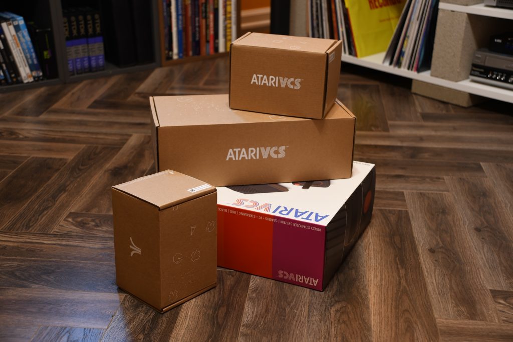
    The first thing you notice when you receive the unit is the beautiful and colorful packaging, much nicer than the original Atari 2600 box from back in the day. Inside are separate cardboard boxes for the console and the two included controllers. The “asteroids” theme is carried over to the inner boxes in a tasteful way that makes you feel like you’re unboxing a premium product. My first impressions were very good.
    The next step was to plug the unit into my TV and boot it up. One of the early complaints with the VCS was that the required updates to the device on first boot could take a very long time to install and sometimes even get stuck. I think these issues had mostly been resolved by the time I got mine, though. The updates did take a while to download, but everything went smoothly and I was up-and-running within a few minutes. The setup does require you to create a login that connects to their servers before you can access any functionality on the device, a process that also went as well as can be expected. We’ll revisit this requirement later in the article, though, when we talk about Atari’s long term support for the VCS.

    Once logged in, I was redirected to the home page and main menu of the VCS’s custom operating system. AtariOS is based on a Linux kernel — specifically a customized version of Debian Linux tailored for the VCS hardware — and provides a streamlined, console-like interface for easy access to games, apps, and media. I found the interface pretty intuitive to use and was able to play some games and purchase a couple of new ones via the online store within the first few minutes. The trickiest part for me was getting used to the controllers.

    Controllers

    One of the other things that drew me to the VCS was their modern take on the classic joystick, and this was the controller I chose to use during my first couple of weeks with the console. It offers a few nice features that weren’t available on the original Atari 2600 joystick including bluetooth connectivity, LED lighting, and a decent rumble effect. By far the coolest addition, though, is the ability to rotate the stick to play vintage games that would normally have required a separate paddle controller. A very elegant touch. The joystick is also more pleasant to use than the original with better control and less hand fatigue during long game play. While it’s great for vintage games designed for a joystick, it’s not as good for more modern games and also makes navigating the menus a bit harder. Before long, I decided to give the more modern Xbox-style gamepad a try.

    The modern controller definitely works better for modern games and general navigation, and I got used to it pretty quickly. It’s similar in layout to the controller for my old Playstation 2, although it’s not as ergonomic and doesn’t feel quite as well built. I’ve been using it regularly for the last year, though, and it’s held up just fine. I use it almost exclusively now for games, and I have an external mouse and mechanical keyboard installed for non-game apps.

    Vintage Games

    The VCS comes with an pre-installed app called Atari Vault that packages together several Atari arcade and home console games from the late 70s and early 80s. The arcade menu includes a lot of very popular and iconic titles developed by Atari back in the day including Centipede, Millipede, Missile Command, Tempest, and Asteroids. There are some conspicuously absent games like Battlezone, Star Wars, and the Empire Strikes back which haven’t been included for licensing reasons, but most of my childhood Atari favorites are present.
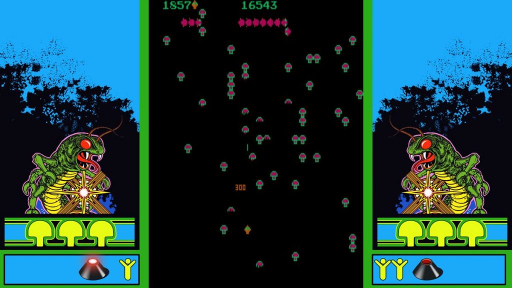
    The VCS uses customized versions of open-source emulators to run all of the games in the Atari Vault, specifically: MAME (Multiple Arcade Machine Emulator) for arcade games, Stella for Atari 2600, and A7800 for Atari 7800 titles. I’ve found the emulation on all of the games I’ve played to be quite smooth, and I’m hard pressed to tell the difference playing 2600 games on the VCS versus playing them on my vintage “light sixer” 2600 console (aside from the controller, of course). In general, it’s a big step up from the often quirky emulation found on the many less expensive retro game emulators you can find at Target and Walmart.

    I also purchased the Atari Vault Volume 2 which is available from the built-in online store. While most of the arcade games in this collection are older ones from the 70s like Super Bug that I remember seeing in arcades but not playing, it does include several 5200 games along with most of the M Network series developed for the 2600 by Mattel. I have most of the M Network games on 2600 cartridges already, with one notable exception in Star Strike. This is the game that I recreated on a TI-99/4A back in the early 80s using an Extended Basic cartridge and a lot of help from my Dad. I may purchase an original cartridge on eBay some day, but it’s nice to be able to play it in on the VCS in the meantime.

    If you want to play classic arcade games from publishers other than Atari, the VCS also comes with the pre-installed AntStream Arcade app. It does require you to create a separate login from the VCS, but it’s a great place to play the occasional game of Ms. Pac-Man, Galaga, Defender, or a whole host of other classic games. When I first tried out AntStream in early 2023, there was the occasional glitch or pause when playing certain titles which was a bit annoying. I’ve tried it more recently, though, and they seemed to have ironed out the performance issues running on the VCS. They do constantly prompt you to upgrade from the free plan to the $6.99 premium one which is a different kind of annoying, but I understand they need to make their money somewhere.

    Recharged Series

    The VCS was also designed to play new games, and Atari has published several modern reinterpretations of their own classic games under the Recharged label. The first title I bought was Centipede Recharged. While not as challenging as the original Centipede arcade game, it does follow the classic Atari formula of being easy to learn but hard to master. The gameplay gets progressively more difficult at a balanced pace that keeps you engaged, but not so much so that you get easily frustrated. And there are all kinds of interesting weapons you can acquire by shooting the spiders that I’ve had a great time exploring. Overall, I was very pleasantly surprised with how fun this game is to play.

    I was always a big fan of the 2600 game Yars Revenge, so the next title I tried from the series was Yars Recharged. I liked this one even better than Centipede. Again, unlike other modern games that are so hard I lose interest before I even get started, Yars Recharged is very intuitive so you can start playing extended games very quickly. The game play is very engaging, and like Centipede it starts to get quite challenging as you get to the higher levels. It’s also a very pretty game to watch. If you’re a fan of the original, you’ll probably like this one as well.

    I’ve also tried a few other modern games outside of the Recharged series. One standout title is Tempest 4000, which is still developed by Jeff Minter for several platforms including the VCS. Like the Recharged series, Tempest is easy to pick up, but rewards you with more challenging game play and longer playing sessions as you become a better player. And it looks cool too. I’ve only tapped the surface of games in the VCS store, and it’s surprising how many titles are available for such a niche product. As a casual gamer with a preference for retro aesthetics and game play, the VCS more than meets my needs for modern game playing.

    Desktop Computer

    Atari also markets the VCS as a desktop computer alternative. You can boot the VCS directly into Linux or Windows using an external USB drive, or you can switch from AtariOS to your desktop OS using the included PC Mode app. Earlier this year, I decided to give this a try and purchased the Atari-branded PC Mode USB stick directly from the Atari site. This Kingston USB 3.2 drive comes preloaded with a custom Debian operating system and includes the Office 365-compatible LibreOffice suite.
    The main problem with the VCS as a computer is its rather anemic specifications. The VCS is powered by an AMD Raven Ridge 2 APU and AMD Ryzen processor GPU with 8GB DDR4 RAM, and 32GB eMMC fixed internal storage. While this default configuration is perfectly adequate when using AtariOS, it can’t keep up with the customized version of Debian that comes installed on the USB. The resource intensive Chrome browser, for example, constantly gets stuck loading even fairly modest static websites. The Chrome browser app in AtariOS, on the other hand, performs just fine. Atari has clearly optimized AtariOS to focus on running a single app or game at a time, with background processes minimized. This allows resource-intensive apps (like streaming services or some higher-end emulation) to run more smoothly within AtariOS than they do on the PC Mode custom Linux.

    Atari recommends that you can boost performance by adding an internal M.2 SATA hard drive or upgrading the RAM. I’ll definitely try that out at some point and see how it goes. For the time being, though, desktop performance is one of the weak points of my VCS.

    Long Term Support

    In late 2023, Atari scaled back its support for the VCS and halted direct manufacturing relationships, shifting its strategy toward licensing partnerships rather than producing additional consoles. Many of us VCS users were concerned that the updates would become fewer and farther between, but I’m happy to report that a fairly major update became available in October with the following updates:

    Hide and Unhide on Home Tab: This feature offers more customization, letting you control which apps and games are visible on your main screen—a great addition for users like me who like a tidier, more personalized layout.

    PDF Support for User Manual and Notifications: Having PDF support directly in the OS makes it easy to access manuals and other documentation without needing an external device. This could be handy for troubleshooting or accessing setup guides right on the console.

    Customize Grid View Options: Allowing users to choose between 3×3, 4×4, or 5×5 grid layouts for their home screen adds flexibility for different screen sizes and preferences. It’s a thoughtful update, especially for users who want to see more (or less) at a glance.

    QuadHD (1440p) Resolution Support: This is a nice touch for users with monitors or TVs that support 1440p resolution, enhancing visual quality for apps, games, and multimedia content.

    Visual Sale Banner in VCS Store: Adding a sale banner is a simple but effective way to highlight discounted content or promotions, helping users spot deals at a glance.

    Earlier in this article, I mentioned that a login is required to use the VCS. If Atari stops supporting it down the road, will they essentially be “bricked”, unable to play even the pre-installed Atari Vault games? Well, probably not. Most likely, Atari would release a final firmware update removing the login requirement or allowing local-only accounts. This would ensure users could still access their content without server authentication. Since Atari Vault and other local apps do not require a constant internet connection, they would continue to function in an offline mode, preserving the console’s ability to play the built-in games. And of course, PC Mode would also remain unaffected by this issue, allowing users to run Linux or Windows from an external drive without needing an Atari login.

    While long range VCS support and development is uncertain, I’m glad that Atari has continued to provide periodic updates every few months. You can also still purchase a new VCS with controllers on the Atari website, and at the time of this writing it’s heavily discounted at $200. At that price, it might be worth taking the risk of future reduced functionality or even a shortened lifespan.

    Conclusion

    Overall, I really love the VCS as a retro gaming console. It’s a country mile ahead of the many Walmart-special games emulators I’ve acquired over the years, and while it can’t quite compete with a modern gaming console, it more than meets my needs for retro-inspired modern games. Let’s hope Atari continues to support the VCS well into the future. Long live the VCS!
  • Embracing Responsive Web Design

    Embracing Responsive Web Design

    One of the more persistent challenges we’ve faced at my day job in recent years has been adapting our “plug-in” web apps to the design constraints of our resellers’ website products. Think, for example, of a camera store widget that can be added to an existing page on an existing website. The user should be able to select from a library of different designs and color schemes to try to make the integration with the site as seamless as possible. When we first built the infrastructure for handling different internal designs, we also came up with some baseline widths (500px, 750px, 950px, etc) that we thought would be able to accommodate the needs of any website designer. Then we wrote separate CSS style sheets for each design, color, and width combination. This seemed like a reasonable approach at the time, but in practice it’s become a real headache as we’re constantly having to adapt to the specific width requirements of each new vendor. And our recent forays into WordPress themes and Facebook frames have only exacerbated the issue.

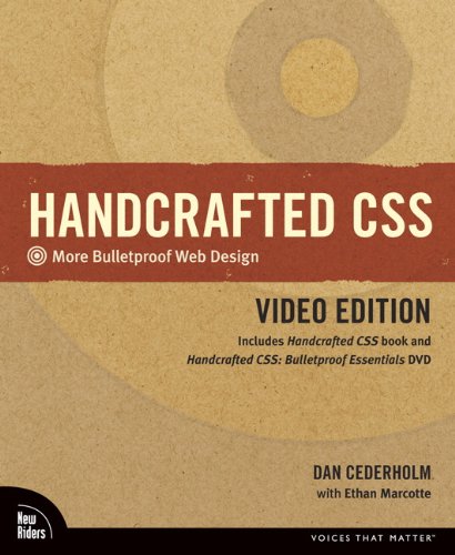
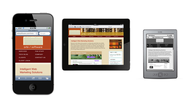
    A while ago, I read and reviewed the book “Handcrafted CSS” which contains a chapter by guest author Ethan Marcotte describing what he referred to at the time as “fluid grids”. The idea intrigued me — even though it was missing a few key ingredients for our specific problem — and I filed it away to think about later. Then Ethan Marcotte released his own book, “Responsive Web Design”, which has since taken the web design world by storm. I bought and read a copy late last year, and I’ve since presented the ideas at my day job where we’ve decided to use them in the next iteration of our flagship product. I’ve also done a mild redesign of the Orbi Software site using RWD in order to demonstrate its flexibility, as well as to finally provide a mobile-friendly version to my users.

    What Is Responsive Web Design?

    Similar to the terms “Ajax” and “Web Standards”, “Responsive Web Design” refers to the bringing together of several existing technologies in such a way that they can be used to create more flexible web designs. RWD allows you to create web pages that dynamically change to suit the proportions of the display canvas. Specifically, RWD leverages the following three ideas:

    1. Flexible, grid-based layouts.
    2. Flexible images and media.
    3. Media queries (a module from the CSS3 specification).

    The goal is to embrace the flexibility inherent in the web without sacrificing the control necessary to create well ordered and aesthetically pleasing designs. And because this is achieved through the use of standards-based technologies — albeit with a slight shift in philosophy — it’s become a very popular technique in the web design world.

    Flexible Grids

    Grids have been a standard of graphic design since its inception. Designers borrowed the grid systems that were a necessity in the early days of typography and print setting, and they repurposed them to create aesthetically pleasing and ordered layouts. Up until the emergence of the Internet, though, design grids always assumed a static canvas or page size. While statically-sized grids have been widely used on web pages in order to improve modularity, their usefulness diminishes when the size of the canvas — or browser window — is dynamically changed based on user input, preferences, and screen size. And with so many new devices being introduced with different form factors, it’s hard to come up with static designs that behave well for any page rendering. RWD seeks to address this issue by making the grids flexible, i.e., using relative and proportional sizes that scale based on the amount of space available.

    To build a flexible grid, first start off with a static grid, making sure that the columns and gutters are all uniform in size. For example, you could build a grid that’s 960 pixels wide, with 70 pixel columns and 10 pixel gutters. Once you have your static grid in place, relative sizes can then be calculated using this simple formula:

    target / context = result

    The “target” is the desired size of the element in pixels, and the “context” is the size of its containing element in pixels. Just move the decimal point of the “result” two places over and you have a percentage that you can plug into your style sheet:

    width: 17.391304347826%; /* 160px / 920px = 0.17391304347826 */

    Marcotte recommends leaving the calculations in your CSS as comments so that it’s easier to make changes later, and I’ve found this practice to be very helpful as I iteratively tweak things over time. It’s also important to note that when setting flexible margins on an element, the context is the width of the element’s container, but when setting flexible padding on an element, the context is the width of the element itself.

    Flexible Images (And Rich Media)

    Images and rich media objects can also be configured to dynamically resize themselves based on the size of their respective containers. This is accomplished through the use of a “max-width” declaration of 100%:

    img, embed, object, video { max-width: 100%; }

    The book discusses strategies for making this work in browsers that don’t support “min” and “max” attributes (like IE6), but for the most part the technique works flawlessly in all modern browsers. There are also tips for reducing artifacts on image resize when viewing images in IE7 — a problem on Windows XP only — as well as recommendations for dynamically serving different images from the server side.

    Media Queries

    Media queries are the final jewel in the RWD crown. Introduced in CSS3, media queries are used to inspect the physical characteristics of devices and browsers in order to dynamically provide the most appropriate styling rules when rendering content. It’s important to note that media queries are not the same thing as “medial types”, something you’re probably already familiar with if you’ve written much HTML. In the CSS2 spec, the W3C defined the following media types as a first attempt to solve the problem of different display formats:

    all, braille, embossed, handheld, print, projection, screen, speech, tty, and tv.

    Unfortunately, the categories were just too broad to be very useful — especially when the market was flooded with different handheld devices — so in CSS3 they introduced the concept of media queries. Every media query has the following two components:

    1. Begins with a media type drawn from the CSS 2.1 specification’s list of approved media types (http://www.w3.org/TR/CSS21/media.html#media-types).
    2. Ends with the query itself, wrapped in parentheses: (min-width: 1024px). The query can be split into two components: the name of a feature (min-width) and a corresponding value (1024px).

    Media queries can be declared in one of three ways: 1) directly in the CSS (see below), 2) using the “media” attribute of a link tag in the markup, or 3) using an @import statement. The first approach is usually preferable so that the declaration only has to be made and retrieved once, and this is how they’re included on this site if you want to take a look at the CSS source files.

    @media screen and (max-width: 768px) { /* Styles specific to this bracket */ }

    Orbi Redesign

    Since I didn’t really have the bandwidth to do a total redesign of the Orbi site, I decided to limit the scope to just a makeover using RWD techniques, at the same time fixing a handful of issues that had been bugging me for some time. While I was in there, I also switched all of the markup from XHTML 1.1 to HTML5. HTML5 is certainly not necessary to make RWD work, but I figured I might as well make the change while I was modifying every web page anyway. And it’s fairly easy to do since HTML5 is backwards compatible. The trickiest part was coming up with a new “reset” style sheet (I ended up choosing this one). Other than the declaration and some syntax, I’m not taking advantage of any cool HTML5 features as of this writing, although I most certainly will in the near future. I smell another blog post brewing…

    Marcotte actually recommends starting with the mobile experience first, then creating media queries for increasingly large breakpoints based on the canvas size. While this is probably good advice, I actually did just the opposite for this project in order to make my life easier. I already had a static layout with a width of 926px, so it made sense to set that as the maximum and then work down. I then chose my breakpoints based on the default viewport widths of three popular devices: the iPad (768px in portrait mode), the Kindle (600px), and the iPhone (480px in landscape and 320px in portrait). You’ll find lots of arguments against the use of device breakpoints in RWD, but for my purposes it was a good place to start.

    For the most part the project went well, although I did encounter some browser compatibility issues along the way that required workarounds. For example, some versions of Opera don’t honor the fractional portion of floating point percentages when specifying element widths. This is complicated by the fact that the browser does honor them for padding and margins. In places where this clearly broke the design, I employed some additional media query brackets with hard-coded widths. Everywhere else, I just embraced the concept of “progressive enrichment”, allowing fallbacks that don’t look quite as good in Opera, but are still functional. Overall, I’d have to say that I’m pleased with the results. It’s nice bringing up my site on a new device and seeing everything fall into line based on the viewport size. And I’m looking forward to using what I’ve learned in my next project.

  • Fun With OSGi and Spring

    Fun With OSGi and Spring

    A few months ago, we started researching new platforms, frameworks, and tools for the next generation of our flagship product at my day job. OSGi was one of several Java technologies that came up during our initial discussions. I had heard of OSGi in its context as the underlying runtime for the Eclipse IDE plugin architecture, but otherwise I knew very little about it. A quick Google search revealed that it’s been rather ubiquitous in the embedded software world for quite some time now as a way to implement service gateways. More recently, forward-looking developers have also started to consider it as a platform for increased modularity in enterprise web applications. This idea piqued my interest, and I decided to do a little research. While we ultimately chose not to use OSGi for reasons which I’ll outline below, I still had a lot of fun putting together a presentation for my colleagues and building a small prototype. I’m definitely going to keep an eye on progress in the OSGi world over the coming months in the hope that someday it will become a standard in the web world too.

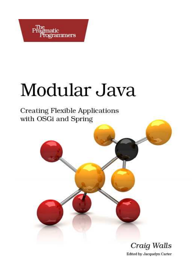
    As I started to research OSGi in a little more depth, I quickly realized that I was going to need to purchase a book to learn the basics before I would be able to really get my head around its complexity. I ended up buying a copy of Modular Java by Craig Walls, author of the excellent Spring in Action (I’m about half way through the latest 3rd edition). The first chapter includes a very good introduction to OSGi and its potential for increasing modularity in Java Web applications. After a brief introduction to the many benefits of modularity — improved changeability, comprehensibility, testability, flexibility, etc — the author describes how OSGi takes modularity one step further than the current set of best practices for overcoming the rather weak support for modularity in Java itself.

    Programmers have lots of existing options for increasing modularity in their code. Some traditional methods for creating modular Java designs include:

    • Organizing packages by function
    • Employing design patterns to create functional layers
    • Abstracting functionality behind interfaces to promote low coupling
    • Using dependency injection frameworks like Spring
    • Breaking large applications up into sets of smaller projects

    While all of these techniques are helpful, OSGi takes things one step further by enabling the development of well-defined, loosely-coupled modules called bundles which extend modularity to the Java runtime. As opposed to JAR and WAR files which include everything in the same class space at runtime, the OSGi container runs each bundle in its own separate class space. This separation makes it possible for the container to be running more than one version of a particular bundle at the same time, hence dependent bundles can be configured to use the one that best meets their needs. And because all of the mutable design and implementation details of these bundles are abstracted behind stable APIs, applications built using OSGi are ultimately more maintainable, testable, and understandable. OSGi also provides a service registry for bundles to publish and/or consume services, thus enabling an “out-of-the-box” Service Oriented Architecture (SOA) running on a single JVM. By the end of the first chapter, I was definitely hooked and wanted to learn more.

    How OSGi Works

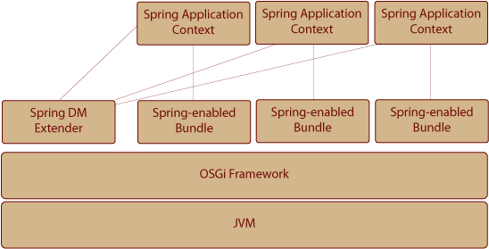
    The OSGi specification defines a lifecycle for modules, as well as providing a service registry and a whole host of services for various tasks. These modules, or bundles as they’re referred to in the OSGi specification, are simply JARs with some extra OSGi metadata in their META-INF/MANIFEST.MF file. Once a bundle has been installed into an OSGi container, it can be started, stopped, and uninstalled via the framework. The container’s service registry allows bundles to publish and/or consume other services, as well as trigger tasks when a bundle is started or stopped. Additional OSGi services include a logging service, an HTTP service, and a configuration service. There’s also an optional security layer that spans the other layers to ensure that bundles are authenticated (via digital signatures or verification of install location). I’ve created a diagram similar to one in the book to illustrate the multiple layers of an OSGi application below.

    OSGI Containers

    There are many open source containers available for running OSGi bundles, but the two most popular implementations are Eclipse’s Equinox and Apache’s Felix. Craig Walls recommends Equinox, and after trying both out a little bit, I’d have to say that I agree. Equinox is more fully-featured and the commands just seem a bit more intuitive. Still, the open source licenses are slightly different, so you may want to review them to see if they meet your business needs before settling on a particular implementation.

    What Is Spring DM?

    Spring Dynamic Modules (now called Gemini Blueprint since being donated to the Eclipse project last year) is a collection of bundles specifically designed to help manage the deployment of OSGi web applications. While the OSGi container can manage the life cycle of WAR files in exactly the same manner as it manages JAR files, the framework itself doesn’t know anything about deploying to a servlet container. Spring DM monitors the service registry for other web bundles, and then deploys them to either Tomcat or Jetty. The core of Spring DM is the “extender,” the bundle that watches for other bundles to be started. If the web bundles that it finds happen to be Spring-enabled, the extender automatically creates a Spring application context for each one found before deploying to the configured servlet container.

    Dude, Where’s My Jar?

    All of the examples in Modular Java are given in the context of a sample application, a search engine called “Dude, Where’s my Jar?” which allows a programmer to search Maven repositories for matching JAR files based on their class, interface, enum, or annotation name. While I appreciate that the author put some thought into the concept for this program and came up with something a little more useful and interesting than the typical “pet store” app, I have to say that I’ve rarely found myself using it since I started using Sonatype’s excellent Nexus repository manager for Maven. More on that in a future post. Still, this app provides a good starting point for learning more about OSGI, as well as the Apache Lucene and Compass libraries it uses for indexing and searching files. I’ll include some screenshots of this app in action here soon.

    Final Analysis

    A couple of months ago, I delivered my presentation on OSGi and Spring DM at one of our long range engineering meetings, after which I demoed a prototype of one of our existing applications using an OSGi service layer. While OSGi captured our engineering team’s interest for a time, upon closer inspection we’ve found OSGi to be a bit too complex and unwieldy to use in its current state. The biggest problem is that we still rely on too many non-OSGi-compliant JARs. While it’s fairly easy to “wrap” a JAR to make it work with OSGi, this quickly becomes cumbersome when you’re using dozens of libraries, many of which have their own non-compliant dependencies. This has also been a problem for the Spring Roo project. They started out with the laudable goal of 100% OSGi compatibility, but then decided to back off until the industry push for OSGi-compliant JARs has progressed a little farther.

    The second problem we’ve identified with OSGi is that the tooling just isn’t quite there yet compared to other solutions. While the Pax Construct project includes some really nice scaffolding tools (similar to Ruby on Rails and Spring Roo), I wouldn’t yet consider it to be a complete toolset for something as complex as OSGi. Sonatype’s Jason Van Zeil has stated that he thinks it will still be another year or two before the tooling is ready for web application prime time. Bottom line: We’re not going to be using OSGi at my day job for now, but I’m definitely going to keep playing around with it. Hopefully I’ll be able to incorporate it into a side project sometime soon. And if I do, I’ll be sure to post my further adventures here.

  • Book Review: Handcrafted CSS (Video Edition)

    Book Review: Handcrafted CSS (Video Edition)

    Early last year when I decided that I just couldn’t put off redesigning the very dated-looking Orbi Software site any longer, the first skill that I knew I needed to get up to speed on was CSS. Like many programmers, I had learned the basics of CSS in a very informal way, mostly by looking at a few online examples and then studying the stylesheets of designers that I collaborated with as a coder. This limited exposure gave me enough knowledge to get by, but I always felt like I was “coding by coincidence” when I had to write my own classes. And some of the CSS files that I was maintaining became rather large and unweildy over time, with lots of unnecessary duplication of similar styles. As the promise of CSS3 slowly started to become a reality with the release of many cool new vendor-specific CSS3 extensions, I finally decided that I just didn’t want to hack my way through creating stylesheets any longer.

    To remedy the situation, I began the search for a good CSS book, specifically one that was up-to-date enough to describe some of the fancy CSS3 effects that I was starting to see crop up all over the place. I ended up purchasing “Handcrafted CSS” because I had read an earlier book by Dan Cederholm called “Web Standards Solutions: The Markup and Style Handbook” a few years ago, and I remembered liking his writing style and attention to small details. Handcrafted CSS certainly doesn’t disappoint in this regard. The author really stresses the value of “craftsmanship” in Web design — not only paying attention to the small details, but also trying to focus on the most important details — and this theme is emphasized throughout the book. He also presents a whole slew of good ideas for subtle “fit and finish” details, many of which I ended up incorporating into the design of this site.

    Like most good technical books, all of the examples in Handcrafted CSS are given in the context of a sample site, in this case the fictional Tugboat Coffee Company. The code can be downloaded from the project website once you’ve purchased a copy of the book. While the layout is clean and very simple, the site does a good job of presenting the techniques described in the text, many of them so subtle that you don’t notice them at first. The culmination of so many nice details really does give the site a modern feel. And it’s also a very good reference to have as you start to build your own site, providing a good example of accomplishing a lot with a relatively small number of classes.

    Progressive Enrichment

    One of the prominent design concepts that weaves its way throughout the book is what the author calls “progressive enrichment.” This idea suggests that we should embrace the power of CSS3 extensions offered by forward-looking browsers, while at the same time providing graceful and functional alternatives for browsers that don’t offer these features. For many, the idea of having a site render slightly differently in different browsers is a hard thing to embrace, and I have to admit that it’s been a sometimes uneasy adjustment for me as well. I’ve slowly come to terms with the idea of letting go of pixel precision across browsers, though, and with few exceptions I’ve tried to embrace this methodology for the websites that I maintain. For example, if you’re viewing this page in any recent version of Internet Explorer (6-9), the logo “orbi / software” above appears in a solid gold box. In most other browsers that support the CSS RGBa alpha channel, however, the gold box appears as partially transparent with the inner gears of the Babbage difference engine image visible behind it. If you compare the site as it renders in IE to Safari, Chrome, or Opera, you’ll begin to notice lots of little details that are slightly different. Still, the concept and design of the site as a whole seems pretty consistent even in IE.

    Despite the book’s many compelling arguments for progressive enrichment, I still wasn’t able to convince the designer at my day job that this was a good idea. This is partially due to his reluctance to give up pixel precision across browsers, but also because a very high percentage of our users are still using various flavors of IE. The author does mention this problem in the text, and he ultimately advises that the progressive enrichment approach may not work in every situation, although developers should certainly strive for it. Unfortunately, at my day job we still have to use many of the same old time-consuming and inflexible tricks to achieve effects like rounded corners and alpha transparencies in browsers that don’t offer much in the way of CSS3 functionality. At the very least, though, the vendor-specific CSS3 extensions of browsers like Firefox, Safari, and Chrome can still be used for rapid prototyping, as well as creating image files from screenshots — something also mentioned several times throughout the course of the book. I followed this advice when prototyping a site catering to an older audience — a fairly high percentage of whom are still using IE6 — and I was able to create several beautiful design elements just by taking screen shots of my CSS-generated rounded corners and alpha fades and then including them as images in the markup. A very useful prototyping tool indeed.

    Fluid Grids

    Near the end of the book, guest author Ethan Marcotte contributes a very interesting chapter on the use of “fluid grids” for web design. The “grid” here refers to layout grids similar to those that have been used for ages in print design, and “fluid” refers to the ability of a site to optimally resize itself based on the size of the browser window. The author starts with a discussion of flexible fonts using an 100% font width on the body, and then relative “em” units for all others (as opposed to the fixed width “px” unit). He then extends the concept to working with layout grids. While I really wish that this chapter had existed back when I tried my own fluid grid design two iterations ago, a clunky attempt at best, I actually decided to stick with a fixed-width design for this iteration, in part because many of my pages simply don’t have enough content to stretch without starting to look too sparse. If I do decide to do something a little more dynamic in the future, though, I know exactly where to look. Ethan Marcotte has recently released a new book called Responsive Web Design that delves into the topic of what he’s retermed as “flexible grids” in a little more detail, and I look forward to picking up a copy soon.

    Video Edition

    I decided to purchase the “Video Edition” of this book which comes bundled with an approximately hour long DVD. In it, the author discusses concepts related to what he terms as “bulletproof” web designs, essentially sites that render correctly in any context on any browser or device. Bulletproof also refers to the quality of being very flexible and adaptable to change. After a relatively brief introduction to these concepts, the author outlines ten guidelines that web developers can use to help their designs live up to these bulletproof standards. Many of the ideas presented here are from his previous book, not surprisingly titled Bulletproof Web Design. Most of the examples are illustrated using the Tugboat Coffee site from this book, however, and in this sense the DVD is a bridge between the two. Four of the ten guidelines are also simple tests that can be used to guage how bulletproof a web design truly is, and they’ve become a valuable part of my web-building toolkit.

    Final Analysis

    Overall, I’d say this is an excellent book for getting up to speed with the latest advances in CSS. If you don’t have any CSS experience at all, though, you may want to learn the basics before reading it. After the introduction which focuses on craftsmanship and progressive enrichment, the book jumps right into real-world examples without giving much in the way of background. Any online tutorial will probably suffice as a primer, though, and once you’ve got the idea of classes and ids down, this book should take you the rest of the way to good CSS design. Verdict: a must read for Web designers and developers, and highly recommended reading for Web programmers who occasionally work with CSS.

  • My Current Development Environments: Text Editors

    In this series of posts, I thought it might be useful to step back and take a look at my current development environments. Environments is plural here because I have more than one: the first on a PC running Windows 7 Professional at my day job, and the second on a MacBook Pro running Snow Leopard which I use for just about everything else. I had originally planned to write a brief overview of all of the major development tool categories — Text Editors, IDEs, Command Line Interfaces, Version Control Systems, Database Tools, and Project Management / Build Tools — in a single blog post, but I quickly realized this wasn’t wise when I hit 3000 words and wasn’t even close to half way through. 🙂 So following is the first part on text editors, and hopefully the rest will follow soon.

    Part I: Text Editors

    I know that this contradicts the Pragmatic Programmer philosophy of learning one text editor and using it for everything — which I think is probably very sound advice — but I actually use multiple text editors for a couple of reasons. First, I could never settle on an editor that I liked enough for every task, especially one which would run natively on both OS X and Windows. The more insidious reason, though, is that I’m just the type of person who likes to experiment with different editors. Sometimes I’ll fire up different versions of Vim or Emacs, for example, just to play around with them and compare differences. I have managed to settle on the following editors for daily use, however, and I use them whenever a full-on IDE isn’t necessary.

    Notepad++ (Windows Only)

    Before my recent switch to the free and open source Notepad++, I had been using an editor called TextPad for several years — mainly because one of the companies I worked for a while ago had purchased licenses for it. Sometimes familiarity breeds appreciation, and over the years I grew to like it despite the sometimes clunky interface. For consistency’s sake across platforms, I configured my TextPad workspace to be very similar to the default BBEdit workspace on my Mac, and for the most part this worked fine. My primary complaint with TextPad was that the default keyboard shortcuts didn’t seem to conform to any common Windows standards. For example, in TextPad you click F5 rather than Ctrl+F for searches. While I can pretty easily switch between OS X and Windows shortcuts without having to think about them much, when I’m on Windows I seem to automatically use the defaults, and it’s been hard to train myself otherwise. Notepad++ shortcuts, on the other hand, seem very natural.

    Another thing that drove me a little crazy about TextPad was that the “Document Selector” which I liked to keep open in the right pane didn’t seem to provide any way to sort documents. While open document tabs could be moved around manually to preserve some semblance of order, they didn’t seem to stay put in any consistent way. This is probably not that big of a deal for most people, but my slightly OCD tendencies lead me to want to keep everything in a particular order. The Windows XP task bar, for example, bothered me in exactly the same way because you couldn’t move items around without closing and reopening programs — something I actually found myself doing on many occasions.

    When a request for a new TextPad license at my day job was delayed, I decided to try out Notepad++ based on the recommendation of one of my colleagues. Once I installed the “Explorer” and “Window Manager” plugins, I was able to setup a BBEdit-like configuration just as I had in TextPad. And just like BBEdit (which I describe below), the Window Manager gives a visual cue of which files have been modified but not yet saved. Next, I installed the “TextFX” plugin which includes many additional features for transforming text. There are lots of other plugins that I haven’t tried yet, but these three alone offer all of the features that I commonly used in TextPad. Overall, it seems to perform really well — not surprising since having a light resource footprint is one of the primary goals of the Notepad++ project.

    I do have a few minor gripes with Notepad++, however. First, The “Find in Files” feature currently displays a dialog box while performing a search, but it doesn’t show the search results as it finds them. This was a useful feature in TextPad because you could always end a particularly long search as soon as the match you were looking for popped up. I often find myself using the “Find in Files” feature for global codebase searches (when I’m feeling too lazy to grep) mainly due to the fact that the Eclipse global search has never seemed very reliable — at least in Windows — often leaving out files in plain sight. Another feature of the TextPad search that I liked better was that it displayed the results in a center text window, appending all additional global search results to the end of those performed previously. It was nice being able to go back and reference previous search results without having to search again. Lastly, the Notepad++ window manager doesn’t seem to let you add another pane to the center window without having it span the entire width of the editor. Not a huge deal, of course, but it’s a slight impediment to arranging things exactly as I want them.

    Despite these minor annoyances, I still slightly prefer Notepad++ to TextPad, mainly due to the more standardized shortcut keys. And unlike TextPad, Notepad++ is free (as in both “free speech” and “free beer”).

    BBEdit (Mac Only)

    I’ve been using BBEdit since the late nineties when a designer friend of mine recommended it to me. BBEdit’s tagline is “it doesn’t suck,” and I’d have to say that I agree with them. Some of the features I find very useful are 1) grep pattern matching for search and replace functions, 2) one-click document statistics including page and word count, and 3) the “project” features which I describe below. The BBEdit shortcuts are completely second nature to me at this point as well which saves time.

    Like Notepad++, BBEdit gives a visual cue when a file has been modified, but it also goes one step further by displaying a different cue when your scrolling position has changed in a long file. That way you can save your spot or choose to ignore it when you close the program. Not a huge deal, to be sure, but it’s one additional little detail that makes you feel more in control of your environment. BBEdit has lots of nice little features like this.

    In the latest version 9 release, BBEdit introduced the concept of a “project,” or what might be called a workspace in other programs. I really like the default configuration with the “project explorer” in the left pane and the “documents browser” in the right, and as mentioned above, I’ve used this as the template for most of the other GUI-based text editors that I’ve used since upgrading to version 9. Another feature in the latest release that I really like is the snappy word autocompletion — faster than most of the programs I’ve tried that implement one. This better-than-average performance is especially useful when writing correspondence or project documentation. I’m a relatively fast typer, albeit a sloppy one, and the autocompletion keeps up with me most of the time.

    As with all of the editors I use, though, there are some minor flaws. The nit that probably bugs me the most is that there’s no shortcut to make all of the selected text either upper or lower case. You have to navigate to the “Text” menu and select “Change Case…” first. Then you can select the options for your transform and press the “Change” button. I imagine that most developers these days probably don’t have a need to do this very often, but I find myself using it all of the time due to the nature of some of the legacy projects that I maintain. It would definitely be nice to have a shortcut for this, as well as for some other features that I would consider to be common use cases.

    Another small drawback with BBEdit is that it’s not cheap — $99 for a single license. I think because it first became popular in the design world where people already expected to pay a lot of money for software (like Photoshop), Bare Bones was able to position themselves at a slightly elevated price point. To me it’s worth it, but for others the advantages may not be worth the steep price tag. You can always download the free trial to give it a spin before you buy, though. And they also offer a free, watered-down version called TextWrangler that may have all of the options that you need.

    Coda (Mac Only)

    Coda sort of straddles the line between an IDE and a traditional editor, making it a bit hard to categorize. Since I use Coda mainly as an editor myself, I’ve decided to include it in this section. I’ve been a longtime fan of Panic’s Transmit program for FTP on a Mac, so when they released a Web development tool, I was intrigued enough to purchase a copy.

    I primarily use Coda for Web programming using scripted languages like Ruby and PHP. It’s fast and lightweight, making it ideal for coding where you mostly just need syntax highlighting. I also use it to edit markup and CSS for the handful of static websites that I still manage. And the built-in FTP support has come in very handy for the sites that I haven’t yet moved over to the cloud. Multiple terminal sessions can be managed using the same tabs as open files, making it easy to switch between an SSH session, a Git log, and a scaffolding tool, for example. The terminal emulator’s text-smoothing option works really well with a monospaced font, and I’m able to apply my familiar “blue background with white font” settings without it looking too messy.

    It’s the little things that really make Coda a pleasure to use, though. For example, the “Sites” tab opens up a “wall” featuring nice looking icons for each Web site project. The icons are actually recent screenshots of each project’s home page which Coda updates periodically. These images are “taped” to the wall with realistic looking transparent tape and a nice drop shadow where the icons curl up as if they’re pieces of paper. There’s also a little slider in the lower right-hand corner that lets you resize all of the icons, similar to the iPhoto user interface. Is a feature like this necessary to open your Web projects? Certainly not. Does it make the interface more elegant and fun to use? You bet. Attention to fit-and-finish details like this is one of the things that drew me to the Mac platform in the first place.

    For Web development where you don’t need the overhead of a full-on IDE — or integration with a project manager / build tool like Maven — Coda is an excellent choice. It also has built in support for the Subversion VCS, although I currently use Cornerstone for that.

    Vim

    I’m not going to go into too much depth here because I think the debates between CLI editor advocates have already been played out in too many other forums. I typically use Vim as my command line editor for Linux, Snow Leopard, and Cygwin, as opposed to the many other available options. I probably wouldn’t recommend it to somebody just starting out with CLI editing, though, mainly because there are dozens of cryptic key commands to memorize. And I have to admit that in many ways Emacs is the superior editor. I use Vim because it’s quick, fully featured, and I’m just used to it. I also like to work on ancient Unix machines as a hobby, and Vim — or at least it’s precursor Vi — is almost always available on these systems. And it also brings back a tiny bit of nostalgia for my earliest days of word processing using WordStar on a CP/M machine!

    So that’s it for text editors for now. Next time, I’ll talk about IDEs that I use on a daily basis.

  • Deploying ColdFusion MX 7 on JBoss 4.0.2 for Windows

    2009 UPDATE: ColdFusion MX 9 has been released since this article was originally published, and it now has Hibernate baked right in.

    Why do I want to use JBoss instead of sticking with Macromedia’s own JRun J2EE Application Server? Well, it’s a little bit of a long story. Most of the application development I’ve done in the past year has been with CFMX, but I often find myself extending the functionality of CFMX with existing Java APIs, for example using JAI to create photo thumbnails or edtftp for FTP operations that require wildcards. A database architect I know through work recently suggested I look into Hibernate, an open source object/relational persistence and query service for Java.

    Not only is it free, but several Eclipse plug-ins exist which can help automate the process of creating data objects and the Hibernate XML mappings which link those objects to tables in your database. As a test I put together a simple Java application using Hibernate for persistence and was impressed with how easy it was to implement and use. I then found a Yahoo user’s group dedicated to getting Hibernate to work in CFMX.

    I downloaded the sample application and was able to get it running on my PowerMac at home, but when I tried to get it to run with IIS on my Windows server I ran into logging errors with the log4j archive. According to one member in the cfhibernate group, there is a bug with JRun/CF for Windows that prevents any Java application using the log4j logging classes from running within CFMX. Unfortunately, Hibernate uses these classes extensively. My only option at this point was to use the CFMX built-in Web server or deploy CFMX on another application server. I deployed CFMX on Tomcat and it seemed to work pretty well, although I didn’t do any extensive testing. I finally decided to try JBoss with Tomcat as the Web server and servlet container, however, so that I can also use JMS for asynchronous method calls. (If you own or can afford the Enterprise version of CFMX, you can use the CFML event gateway for asynchronous CFCs. I’ve tested it with the developer edition and it seems to work pretty well.)

    The first step is to download and install the latest version of JBoss. Make sure you have a Java JRE on your machine first, though, or the installation will not work. JBoss used to require the full JDK install, but as of version 4.0.2 all it needs is the JRE. I used Java 1.5 and installed it into the “C:\Java\jre1.5.0_04” directory instead of the default “C:\Program Files\Java\jre1.5.0_04” to avoid problems that the space in the path name can cause. Next, unzip the JBoss zip file to the folder where you want JBoss to live, in my case “C:\jboss-4.0.2”. If you have the full JDK installed, set the JAVA_HOME environment variable to point to that directory. Now all you have to do to start JBoss is launch the “run.bat” file in the “C:\jboss-4.0.2\bin” directory. You’ll see several lines scroll by in the console window until it says something like “Started in 15s:837ms”. You can test to see if it’s running by going to the welcome page at http://localhost:8080. To shutdown the JBoss server, type Ctrl-C at the console command prompt. Since I prefer to have JBoss automatically load when the server is rebooted, I set it up as a Windows Service. Once JBoss is running, use the Coldfusion installer to create a EAR or WAR file for deployment. 

    At this point you could simply drop the EAR file you created into the “C:\jboss-4.0.2\server\default\deploy” folder and JBoss would automatically deploy it, but this would also cause it to redeploy every time you restarted JBoss and you would lose your CF admin settings. Instead you can “explode” the EAR using the Java jar command or a ZIP utility like Winzip (Java archive files use the standard ZIP file format). If you’re using Winzip, you’ll need to rename the extension to “.zip”. Create a folder in the “C:\jboss-4.0.2\server\default\deploy” directory called “cfusion.ear” where the “.ear” is part of the folder name, then create a subfolder called “cfusion-war”. Extract the “cfusion.zip” file you created to the “cfusion.ear” directory, then rename the resulting “cfusion.war” file “cfusion.zip”. Now extract cfusion.zip” to the “cfusion-war” directory and delete both “.zip” files. The final step is to edit the “application.xml” file in the “cfusion.ear\META-INF” folder. Change the content of the “web-uri” node to “cfusion-war”. The context root should already be set to the value you selected during the CFMX install process. You can now restart JBoss and CFMX will be automatically deployed. CFMX will not be redeployed again on restart as long as the “cfusion.ear” folder remains in the “deploy” folder.

    The first time you visit the CF Administrator to complete the CF configuration, you may want to use IE as I’ve noticed it will sometimes hang in Firefox. Once the initial configuration is complete and you’re in the administrator, Firefox seems to work fine.